
How to Choose a Color Palette for Your Handmade Decor

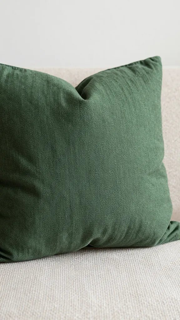
An orange-tinted lamp shade, a forest-green throw pillow, a blush wall hanging—your handmade decor deserves a color story as good as the craftsmanship. Picking a palette can feel nerve-wracking, but it doesn’t have to be a mystery novel. Let’s walk through practical steps so your creations shine without the guesswork.
Know Your Mood: Start with a Feeling, Not a Color
Your color palette should serve the vibe you want in the room. Do you want calm and cozy or bold and energetic? Identify the mood first, then translate it into colors.
- Calm/Cozy: soft neutrals, muted blues, warm taupes
- Energetic/Bold: bright accents, saturated primaries, contrasting neutrals
- Minimalist: black, white, and one or two accent hues
- Whimsical: playful pastels or unexpected combos like sage green with coral
- Ask yourself: What feeling do I want guests to experience when they see my piece?
- Write down 2-3 mood keywords and pick colors that map to those words.
Look Around Your Space: Let the Room Tell You What It Needs
Your surroundings act like a color compass. If you’re decorating a small room, lighter tones can open the space. If you’ve got a statement wall, use complementary colors to make your piece pop.
Color Anchors: Start with a Dominant Hue
Choose one main color that will dominate your piece. This anchors the palette and makes decisions easier as you add accents.
- Pick a hue that appears in the room or in your decor vibe.
- Test it in small swatches before committing to yardage or fabric choices.
Add a Second Color for Depth
Your second color should support the main hue and help create contrast. Don’t be afraid of a color wheel moment here—complementary or analogous schemes work wonders.
- Complementary: blue with orange, purple with yellow
- Analogous: blue, teal, and turquoise for a cohesive feel
Bring in a Pop with an Accent
An accent color is your happy surprise. It should stand out enough to catch the eye but not clash with the main tones.
- Limit to one or two accents to keep things cohesive.
- Use accents in small doses—trim, embroidery, or a single decorative stitch.
Think in Neutrals: They’re Your Best Friends

Neutrals provide rest for the eyes and make colors sing. They also give you room to breathe if your pieces get a little too excited.
Neutral Options You’ll Actually Want to Live With
Consider warm and cool neutrals to balance different color families.
- Warm neutrals: ivory, beige, warm gray
- Cool neutrals: dove gray, crisp white, graphite
- Textured neutrals: off-white with a hint of cream or taupe
Test, Test, Test: Mini Experiments Save Major Regrets
Color choices don’t survive the fabric, light, and distance tests. Do little tests before you commit to materials.
Swatch Strategy
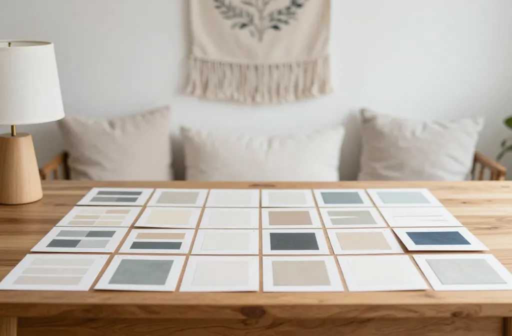
Create small swatches of your chosen colors and place them together in the actual space or on the actual item.
- View under different lighting (daylight, lamp light, candlelight).
- Mount swatches next to similar textures you’ll use (linen, wool, cotton).
Digital Mockups: Lean In, No Pain
If you’re comfortable, mock up a quick digital version of your piece to preview how colors behave side by side.
- Use simple software or even a photo editor to swap colors.
- Don’t overthink; a rough preview helps you avoid costly missteps.
Material Matters: Color Really Reveals Itself in Texture
The way color reads on fabric, yarn, or paint depends a lot on texture. A color that looks perfect on a color wheel may shift when applied to a natural fiber.
How Texture Impacts Perception
– Matte finishes soak up light, muting brightness.
– Glossy finishes reflect more, making colors pop.
– Heavier fabrics (like wool) soften colors; sleek fabrics (like satin) sharpen them.
- Match finish to mood: matte for cozy, satin for a touch of glam.
- Consider fiber content when choosing dye or paint products.
Color Harmony Rules (With a Friendly Twist)
Rules exist to be learned and then happily bent. Here are some practical guidelines you can actually follow.
Classic Combinations to Try
- Muted neutrals with a bold accent: cream, charcoal, and a terracotta pop
- Cool palette: navy, sage, and ivory with a splash of gold
- Warm palette: sand, olive, and coral for a sunlit feel
When to Break the Rules
If a combination makes your heart sing, go for it. Your space, your rules, your vibe.
- Unexpected pairings can become signature looks.
- Just ensure enough contrast so nothing gets lost.
Practical Tips for Handmade Decor: Time, Budget, and Color
Color planning should respect your craft’s realities. Materials, budget, and time all influence what you can actually pull off.
Budget-Friendly Palette Tricks
- Reuse leftover yarns or fabric scraps for patchwork pieces.
- Choose one premium color and mix it with affordable neutrals.
- Shop off-season or in sales to snag colored fabrics at lower prices.
Timeline Hacks
– Start with color decisions early, then map them to steps in your project.
– Allow extra time for dyeing or painting rounds to achieve the exact shade you want.
FAQ
1. How many colors should I use in a handmade decor piece?
The short answer: start with three. A dominant color, a supporting color, and an accent color give you plenty of depth without chaos. If you’re craving minimalism, two can work—just rely on texture and finishing to add interest.
2. How do I choose a color palette for a small space?
Keep the palette light and cohesive. Use a dominant light color, add one or two slightly deeper neutrals, and sprinkle a single bold accent. Layer textures to create depth where color alone can’t.
3. What if my lighting changes how the colors look?
Lighting is a color chameleon. Test colors in the actual space under the lighting you’ll use most. If possible, view colors at different times of day to see how they shift.
4. Can I mix metallics with my palette?
Absolutely. A touch of metallic (brass, copper, or gold) can elevate a palette, especially in accents or trims. Balance it so it doesn’t overpower the main colors.
5. How do I fix a palette that feels off?
Step back and simplify: remove one color, or swap an accent for a more muted version. Sometimes rotating one hue by a notch or two is all it takes.
6. Are digital tools trustworthy for color decisions?
Tools help, but they’re not perfect. Use them as a guide and compare against real swatches in your space under your lighting. FYI, human eyes matter more than screens.
Conclusion
Choosing a color palette for handmade decor doesn’t have to be a drag. Start with the mood, let the room guide you, and test often. When in doubt, keep it simple: one dominant color, a supporting partner, and a little zing of an accent. Your pieces will feel cohesive, intentional, and totally you. Happy crafting, friend—may your color stories be bold, balanced, and a little bit cheeky.