
How to Style Handmade Decor So It Does Not Look Cluttered

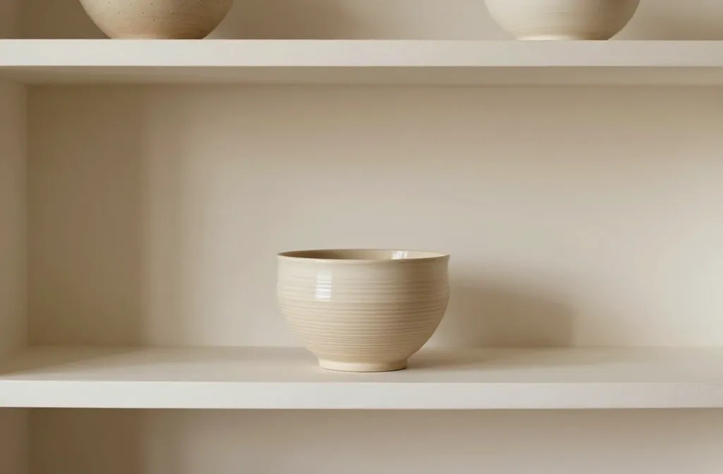
An upbeat guide for turning quirky, handmade pieces into a cohesive, magazine-worthy space. Forget chaos; you can honor your favorites without overwhelming your rooms. Let’s make your handmade treasures feel intentional, not chaotic.
Start with a Clear Vision: What Does “Clutter-Free” Look Like to You?
– Before you pull out every clay pot and woven wall hanging, pause and define your vibe. Do you want calm neutrals with a few bold accents, or a colorful gallery wall that reads like a story?
– Take a quick inventory: which pieces truly spark joy, and which ones are more “nice to have”? Be ruthless, but kind to your future self.
– FYI: Your space should feel breathable. If you can’t see a surface, something’s off.
Curate Instead of Collect: The 3-Item Rule (Plus a Quick Edit)
It’s simple and surprisingly effective: pick your top three handmade pieces for each zone, then only add one supporting item. Your shelves won’t groan under the weight of every craft you’ve ever made or found on a flea market binge.
- Lead piece: The statement handmade item that anchors the space.
- Secondary piece: A complementary item that echoes colors or textures.
- One accent: A small, low-contrast piece to prevent flatness.
If you can’t decide which to keep, photograph the space with and without the item. If you can’t tell the difference, maybe it’s time for a swap.
Anchor with a Neutral Base and Let Handmade Shine

Neutrals don’t have to be boring; they’re the unsung heroes of styling. A calm canvas lets the craftwork do the talking.
- Choose a neutral palette (think warm whites, soft beiges, stone, or muted grays).
- Limit texture clashes by pairing natural fibers with similar weight textures—think cotton, linen, jute, or wood.
- Reserve bold color for accents—a single statement vase or a hand-dyed throw keeps the eye moving rather than shouting.
Pro move: keep surfaces mostly clear. You’ll notice your crafts pop when they aren’t competing for attention.
Display It with Purpose: Grouping and Spacing That Works
Grouping creates visual weight and a sense of intentionality. But spacing matters just as much as what you display.
How to group handmade pieces
- Use odd-numbered groupings (3, 5) for a natural feel.
- Mix heights with stands, books, and boxes to create a dynamic rhythm.
- Balance across the room, not just on one wall—your eye will thank you.
Spacing rules that save clutter
- Leave negative space—don’t fill every inch of a shelf.
- Rotate seasonal or new finds to refresh the moment without buying more storage.
- Put frequently used items within easy reach; display pieces get better with use, not dust.
Materials and Colors: A Cohesive, Not Cookie-Cutter, Palette
Texture and color are your best friends when styling handmade decor. You don’t need to match every piece exactly; you just need a shared language.
- Texture harmony: Pair smooth ceramics with rough textiles if you want tactile interest.
- Color logic: Pick 2–3 core colors and use variations of them across pieces.
- Metal accents: A hint of brass or matte black can pull disparate crafts together.
IMO, don’t chase perfection—chase cohesion. Your eye will thank you.
Function as a Feature: When Handmade Becomes Everyday Use
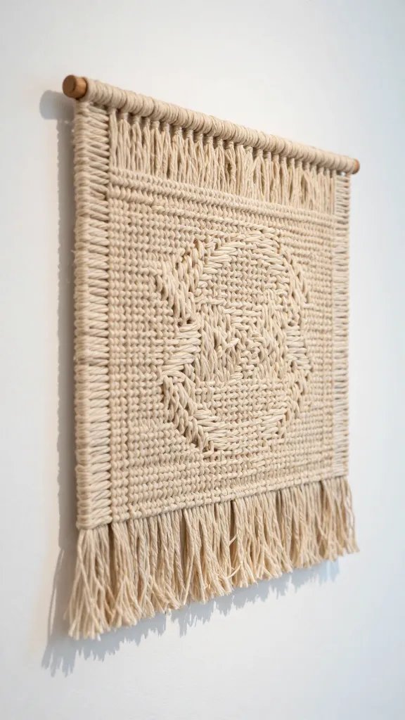
Handmade pieces don’t have to be display-only trophies. If something serves a function and looks good doing it, you’ve won.
- Use handmade bowls for daily fruit, not just shelf candy.
- Crafted coasters, placemats, or textiles that actually get used become part of your routine, not museum pieces.
- Storage that looks intentional can hide a world of clutter behind closed doors.
FYI, practical pieces often earn the most love when they’re within arm’s reach and still look good.
Layering and Light: The Subtle Tricks That Make It Feel Right
Light and layering are the sneaky heroes of cohesive decor. They create mood and hide minor missteps.
- Layer lighting: A mix of overhead, task, and accent lights makes texture pop.
- Soft shadows: Place elements so they cast gentle shadows, which adds depth without drama.
- Mirror magic: A well-placed mirror can double the impact of a handmade piece and brighten a dim corner.
When in doubt, sit back and squint. If the room reads busy, you’ve probably over-layered. If it reads cozy, you’re close.
Storage Smarts: Tidy Systems That Support Your Style
Clutter-free doesn’t mean cold. It means intentional, accessible, and tidy.
- Use decorative baskets and boxes to tuck away seasonal crafts.
- Label gently—don’t turn storage into a scavenger hunt.
- Choose display surfaces with built-in storage, like a shelf with a small drawer or a bench with cubbies.
Keep a monthly quick-edit ritual: 15 minutes to decide whether a handmade item earns a permanent spot, a rotate-out spot, or a new home.
What to Do When You Love It All: Gentle Boundaries for the Deeply Handmade
Loving every piece is a good problem to have, but it can also lead to chaos. Here’s how to set boundaries without losing your personality.
- Set a “one-in, one-out” rule for new finds to prevent overwhelm.
- Rotate favorites seasonally—store the rest out of sight and swap in with a simple calendar reminder.
- Curate a “maybe” box for items you’re unsure about. Revisit in a month; if you don’t miss it, let it go.
FAQ
How do I start styling handmade decor if I have a small space?
Start with a single vignette on a coffee table or a mantle. Choose one dominant piece and two smaller supporting pieces nearby. Leave room to breathe and avoid crowding edges. Small spaces shine when every inch has purpose.
What colors work best with handmade textures?
Neutrals are a safe, stylish anchor. Think warm whites, soft taupes, and stone. Add depth with earthy tones like terracotta, charcoal, and sage. Let one bold color pop as an accent—think a single vase or textile.
How can I tell if a piece looks cluttered or cohesive?
Ask yourself three questions: Does the space feel calm or busy? Do colors/textures repeat in a way that ties pieces together? Is there at least one negative space area that draws the eye somewhere intentional? If you answer yes to calm, you’re on the right track.
Should I mix handmade with factory-made items?
Absolutely. The trick is to balance scales, textures, and color. A handmade ceramic next to a glass object can feel curated if they share a color family or weight. Don’t be afraid to contrast—just do it thoughtfully.
How often should I refresh handmade decor?
Seasonally works well for many. A quick rotation every three months keeps things fresh without becoming a full redo. If you have a sentimental collection, rotate a few pieces at a time to avoid overload.
Conclusion
Handmade decor is the soul of your space, not its chaos. With a clear vision, smart grouping, and a gentle touch of restraint, your unique crafts become the stars rather than the supporting cast. Remember: less can be more, and careful curation beats sheer quantity every day. So go ahead, style boldly, but with intention—and enjoy a home that feels warm, personal, and wonderfully uncluttered.